
Doodling ravens & writing poems

Hello again, friends!
It’s been a little while since my last post, I had intended it to go out in March, but as usual, life got a little bit busy, and I’m left sat here, wondering how we’re already basically halfway through April! I’m certain that once spring begins to properly bloom, the year begins to fly by quite dramatically, but I’m not going to complain too much as it was a long winter and I’m extremely grateful for the warmer temperatures and brighter, sunnier days.
So, in today’s blog post, I’m going to be rambling about…

At the start of this year, I started working on a small personal project that’s a poem about a raven and some singing mice, and I wanted to write about how it came into being and the process behind creating one of the images for it. If you’re not sure what I’m on about, then you can find some of the other images on my Instagram along with the poem!
The project has actually started evolving into something new and exciting, so I have to be a bit limited in what I write in terms of the plot and what it’s about, but I’m hoping this will be a good insight into what went into making a project like this and why I did it.

One of my biggest goals for this year has basically been so start focussing on my own projects more, and to start writing - something I used to enjoy doing a lot, but haven’t done since I was a teenager, so it’s not something I’m hugely confident in now. I therefore wanted to create something short and silly, that encouraged the use of narrative-driven imagery, and that was completely achievable… because I’m very good at starting personal projects and then never finishing them.
The whole idea for the story came from a dream that Tom had, where he dreamt we were walking through a forest and we heard a strange sound so decided to follow it, and found the source had come from a trail of singing hamsters - exceptionally silly! I thought it might be fun to rewrite it so it’s a raven (because I like drawing ravens) who hears the sound and finds a trio of singing mice, it was short and simple, and felt like the perfect way to start writing and illustrating a narrative.
My original aim with this project was to turn it into a very small, wordless zine as I didn’t feel confident enough writing with words at this point, so I wanted to focus on telling the story through just the images, and I felt like giving myself the goal of a zine would encourage me to view it as a book rather than just a series of pictures.
So I began in my sketchbook, creating a page plan/storyboard:

(I’m so sorry I can’t share the full storyboard, it’s simply because my plans have changed with this project, as I mentioned above!)
As I worked on this, I began to struggle visualising it as a physical book. I think this was because with books, the page count has to be a multiple of four (because of how books are printed/made), so if you need to add any more to the story, like one page, it could end up being four pages instead just to make the page count work. I’m not very good with numbers, so I was getting really confused because it was only a short story, and I couldn’t work out the flow and page count. I’m also a very tactile person, so it was really hard to visualise how it would work without it being an actual physical book in my hands, so I decided to make a very rough, very tiny zine!


If you’re ever writing, or even working on a book for someone else, and find yourself in a similar position then I cannot recommend doing this enough! It was so incredibly helpful in terms of working out the pacing, how the images would flow together, and even what a potential cover could look like.

It was at this time that the poem came to me, and I know poetry is a difficult thing to do, and mine isn’t the greatest piece of poetry, but I’m really proud of it because it came very naturally in that moment and I think it tells the story well for something so simple (basically, it’s not the best but it does the job!). However, even though there’s now some accompanying text, it’s still very much second to the images, so I didn’t try to rework the imagery to incorporate the verses. Instead I was just going to get it printed as a separate bookmark to go alongside the zine, but unfortunately plans have changed a bit so there currently won’t be a zine or bookmark… for now.
At this point in a project, especially if I’m working for a client, I would take the very rough thumbnails from the book mock-up/storyboard and sketch them out bigger and neater on my iPad before transferring to paper and painting. But I decided not to do this for this project, as it was for fun, and I felt like the rough images corresponded well with what I had in mind, so I went straight to paper.
The supplies I used to paint the pages were:
Holbein acryla gouache in olive and mustard (mostly mustard)
Daler Rowney graduate acrylic paint in white
Winsor & Newton black indian ink with a fine nibbed dip pen
Fabercastell polychromos coloured pencils in earth tones and black

* Apologies, I think the exact sets I used are potentially being discontinued as I struggled to find them anywhere but Amazon, and the soft pastels don’t seem to come in this small set anymore.
And I chose to paint on Daler Rowney smooth heavyweight paper as it’s really smooth and I like the warm off white tone the paper has, so working with any material on it doesn’t feel too stark. Please note that it’s not the thickest paper (220gsm) so I don’t recommend it for heavy watercolour/gouache work and it does buckle - I used this paper throughout my degree in similar materials, so I knew it would work really well for me! I also used a Q-tip/cotton earbud to smudge small areas of the soft pastels.
As I mentioned above, I started by sketching freehand directly onto the paper, and I just used a soft graphite pencil for this to help get different intensities in line and keep it loose, I also wanted some of the line work to show through! It’s probably good to mention here that I usually sketch in a red pencil as it’s easy to paint over (graphite can smudge when paint is added), and I did actually do this for some of the other pages.

I then did a wash of soft pastel (a light ochre colour) over the whole sketch, smudged it with my finger, and then went into the background with a burnt umber pastel, smudging it with a cotton bud. I wanted to build a muted palette in layers as I wanted the colours to have depth, even though the range of colours were limited, so there’s going to be a lot of that in these images.


I started blocking in the raven with two layers of soft pastel - I used a lighter umber with a darker umber on top, smudging it with a cotton bud. I also used the darker umber pastel on the background again, between the trees, over the layer I had already added, then over this I started adding the gouache. Using the pan gouache, I roughly mixed the dark prussian blue (it has a more turqoise hue to it than ultramarine) with burnt umber to make an almost-black colour, and applied this to the dark areas of the background.
I also mixed the olive and mustard acryla gouache together with white, and started applying it in rough brushstrokes to the ground.
As you can see from the top corner of the first image, I had the little dummy book open on that spread so I could make sure I get the values right and try to replicate its looseness as best I could in the painting!

Next, I blocked in the trees and log:
The middle tree and log were painted in slightly different mixes of yellow ochre, bright red, and warm yellow using the pan gouache. For the middle tree in particular, I think I also might have mixed in some of the mustard acryla gouache to make it more yellow and a thicker consistency.
For the bendy midground root, I used the same mix but with more red and a bit of burnt umber to make it warmer and a bit darker.
The background trees were painted in the same mix of colours but with a lot more tubed white gouache (either normal gouache or acryla) in them to make them paler/less saturated. Over some of them, I used the burnt umber/prussian blue mix, using more water to make it more of a gentle wash so they looked like they were more in the background, but still lighter than the background (I really hope this is making sense!).
I also went over the raven with a black oil pastel and coloured pencil.

I then had a lot of fun here! I started splattering watery paint over the top of everything for some interesting texture, I just took a large flat headded brush, dipped it in water, dipped it in the paint and made it nice and watery, then spattered it with my finger over the paper!
I just used the same mixes as before, alternating between the darker umber/blue mixes, and the warmer ochre/red/yellow mixes to add some dimension to the splatters.
I also felt like the ground was a little too vibrant and olive at this stage, so I painted over it using white (either normal or acryla gouache) to mute the saturation a bit. I also did this to, again, add more dimension to the painting, so it wasn’t just one tone!

After this, it was time to get the pencils out and start adding some depth to the background! I used a dark brown on the wibbly wobbly root and the central tree. To the background trees, I very gently used my favourite polychromos colour, dark indigo, to add some shadow to them.
I also used my pan gouache to paint in the background roots with burnt umber, which I also used to create some shadow under the raven, and used the umber/blue mix on the raven himself - using it over the oil pastel gave it a really nice uneven coat to him, so even though he’s small and black, there’s still a lovely level of colour depth to him.

At this stage, I felt like the image needed some bolder colours, so I switched fully to acryla gouache as it’s more opaque and behaves a little more like acrylic paint. I painted the log with mostly yellow ochre and a touch of mustard and white, making sure to leave some of the layer below showing to give it some texture and depth of colour.
I also covered the floor with pure mustard, using small brushstrokes, again leaving the under-layer exposed, partly for texture, but also to build the environment a little, implying the ground is uneven. I added similar strokes of yellow ochre over the top for the same reason.
I went back to pan gouache for the rock in the corner, mixing pre-mixed grey and prussian blue to get the different tones (more blue makes it darker).

And because I had then painted over a fair bit of the lovely spattering I had done earlier… I added some more!

It was then finally time to block in the sound wave, I used plain white acrylic, not mixed with anything else. I did a couple of layers of it, enough to block out most of the splatters, but still kept some of the brushstrokes showing. I knew I wanted this to be the flattest part of the painting, but I didn’t want to go too far as I didn’t know how flat I wanted to go, and I knew I could just edit it digitally if I wanted it to be flatter.
I also held off painting it in until this point because I wanted it to have a clean edge, and if I had done it earlier, when I hadn’t finished the background, I would have just kept painting over it and wasted my time! So I waited until the background was basically done.

I then went back to the coloured pencils, I used the dark brown on the log, and outlined certain details, like the log, bendy root and rocks with the black. I also painted in the raven’s eyes with white acrylic and drew the purple in with black coloured pencil.

Finally, I added in the final details:
I used dark brown with a gentle layer of black to do the foreground leaves and grass, as well as the grassy details in the ground. The dark foreground plants were painted using a base of black coloured pencil and then a layer of black Indian ink, drawn in with an extra fine nibbed nip pen, which I also used on the raven, drawing in his legs. I also added in some subtle lines to the raven’s body so that his wings were more defined!
And that’s everything! The process for the other pages were basically the same, the only difference is that on some of them I used a red pencil to sketch the image rather than graphite. All the colours were the same and how they were layered up as well.
I hope this has been an interesting read and, most importantly, that it’s made sense! Please feel free to let me know what you thought in the comments. :)
Thank you, as always, for taking the time to read my silly ramblings, I hope you’ve enjoyed it and take care!
Ruth x

OTHER EXCITING BITS
My NEW online shop is coming soon! It’s all ready to go and I was going to launch it today, but then I remembered we go on vacation in a week and it seemed a bit silly to do that, so instead it’ll be launching in early May, and here’s a little teaser of some of the new products!


The new shop looks SO good and I can’t wait to share it with you! I’ll be sending another Newsletter out in around three weeks once it’s open, eeee!
Last weekend we went to Edinburgh for the Endless Love Creative market, where I got to sell my work at the beautiful Fruitmarket Gallery, it was such a lovely venue and such a great experience! The organisers are always wonderful and we had the best table neighbours.
We made a full trip of it and got to spend the day exploring Edinburgh! It was our first visit there and we loved it, the city is so beautiful and the architecture and cosy streets are just WOW. It’s also got such a lovely atmosphere given it’s a big tourist destination and capital city. The only thing we didn’t account for was the surprisingly high temperature drop from 20 degrees in York to only 7 degrees in Edinburgh! We had to buy some emergency jumpers!
I took a few photos, though, and am hoping to have a gentle moment some time soon to sketch from them.


I’m taking a break from selling at markets/conventions for a while now, my next one won’t be until Thought Bubble in November! Instead, I’m going to continue focusing on personal projects, my portfolio and growing my online shop. I absolutely love selling in person and it’s always a wonderful experience, but it’s also very exhausting with all the build up beforehand, the travel, and then a busy day of interacting with people. So I need a little break!
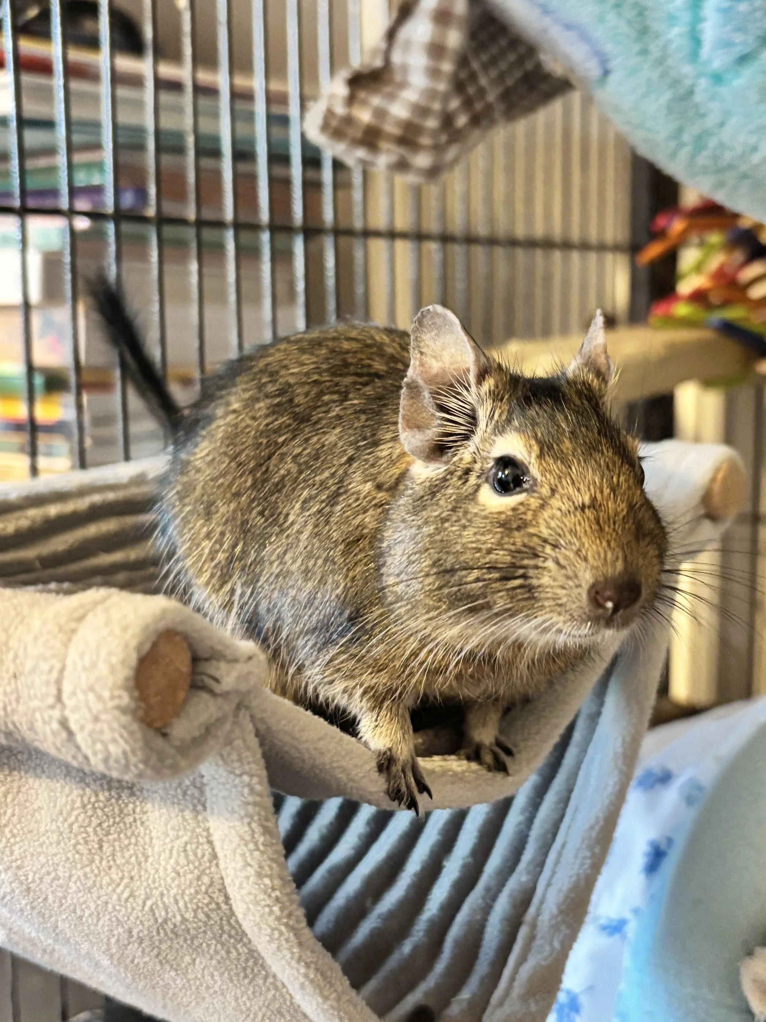
In degu news, they’re all doing well, especially Moyashi and Chewy. Aramis (the little one in the photo) unfortunately had an injury last month that she’s still recovering from, we think she either had an infected bite or hurt her leg, so she’s been on antibiotics and is still on pain relief medicine, poor bean. She’s in good spirits, though!
I’m currently teaching them tricks, like climbing onto my shoulder from the ground, it’s going well! They also climb onto my hand on command and do tiny high fives.
If you’re interested in more frequent degupdates, then feel free to follow their Instagram! I’m more active on there than I am my actual account, haha.
And that’s everything for now, thank you so much for reading and I hope you’re all doing well, I’ll leave you with some of my tiny joys from the last month. :)
TINY JOYS
Music
I’ve revisited Belle & Sebastian’s first album, Tigermilk, it’s been the one thing I can listen to while I write, and is also probably quite fitting as we were in Scotland last weekend!
Books
I’ve become deeply invested, once again, in the Old Kingdom books by Garth Nix and have stormed my way through Lirael, and am now reading its sequel, Abhorsen. I’m then going to go onto Clariel before Goldenhand, which I haven’t actually read yet and I’m so excited! I’ll then go back and read Sabriel, which I skipped this time because I really wanted to draw some bits from Lirael… none of that sentence was at all confusing…
But yeah, if you’re into fantasy novels, then I cannot recommend these books enough. I’ve been hooked from the age of 14!
TV & Film
I can’t seem to get on with current TV shows, so I’ve just become invested in shows from the 00s. We’re currently working our way through Prison Break and I’m watching The Office US in the background while I work (for the millionth time). I’ve also been watching loads of Game Grumps, and have worked my way through their Phoenix Wright play throughs, Majora’s Mask and now Ocarina of Time.